Friday, 11 May 2012

Finished Magazine


This is the magazine cover I have completed as you can see I have applied many features in which I throuhly feel meet my magazines age rage and genre. These features are the masthead, the tagline, the price, splash headlines, bar code, tagline, incentives and I have created an image after originally taken this image to editing it on a software known as Photoshop.
So firstly I will talk about my magazines masthead, the masthead I have used has been my creation that I have done using Photoshop, I feel that where I have placed the image is good as it will be the house-style that will be kept throughout every edition of this magazines existence. I have used intialism "MK" which is in black with a drop shadow effect used to make it stand out from the background this effect also matches the natural image where by the shadow is on it, this caused a problem as I had to make the shadows match one another. I have than put "Music Key" underneath the "MK" text this tells people where it the "MK" comes from. I came up with these Ideas after looking/researching music magazines which have used this type of masthead for example the "Q" in the Q magazine, The next feature I will talk about is the tagline.
The tagline I have used at the top of the magazine front cover this position is used throughout the magazines edition therefore a house-style is created which is very important so that therefore the audience will know without reading the magazines masthead which magazine this is. I have tried to make it match my audience by using capitals making it stand out and also used red to make a certain word pop from the sentence - Then placed a faded box onto the background of the text this creates a more sophisticated look for the magazine. Once I had done this I created a price fore the magazine.
The price of the magazine was thought up after looking at magazines that I would compete with therefore I decided that in order to make my magazine affordable however to low of a price and people would feel that its cheap and tacky I gave it a standard price of £3.99.
The next feature I have created is the splash headlines these are the names of the artists that will relate to the contents of the magazine. I have made these fonts all the same therefore there is no more than three fonts used on the front cover which is from my research right as they did not use a lot of fonts as it seems disjointed from the magazine. I have used the same colors for each of them just alternating.
I have then created a bar code as this is a standard that is needed throughout the magazine industry I have placed mine on the front cover although some magazine companies place them on the back of the magazine. The next feature I have used is the tagline, this tagline is "WORLDS GREATEST" this refers to the magazine and I have placed it at the bottom, in some ways you could say this is an incentive for the audience as this is what magazines do to encourage people to buy the magazine separating themselves from all the other magazines, however I have used an incentive in the magazine which is Free CD with purchase this is done by many magazines also relates to Ashley Warner the new upcoming star and the main feature of the magazine.

I then created an image using Photoshop for the background of the front cover, to create this cover a lot of skill was needed as it involves keeping some of the image whilst removing other bits, I have erased so things out of the image as i felt they didn't comply with the rest of the magazine for example I removed a stone pole from the fence behind Ashley Warner. Once this was completed I then went and edited the lips and the colour of the top, in order to do this I made a duplicate layer and then made that layer black and white whereby I then went back to the original and selected the colour of the lips once this was done I could rub out the black and white layer to keep the lip  shade and the top shade. In order to make the photograph work with the text etc, some text had to be moved as its important in any music magazine that nothing conflicts with the image therefore I took the image and brought it in front of the text to create the look I have in the above image. I also believe that the costume I have chosen is good as it is trendy and meeting my audiences needs (teens) as they will keep up with fashion and gain fashion advice through celebrities and what they wear. I have applied this due to research I have done as seen previously in my blog I have made a blog post about how costume is used in magazines.


This is the contents page I have created for my magazine "Music Key MK", I feel from this contents page that I have applied all the essential features/terminology as after looking through a variety of examples and gaining inspiration from it I have applied them. These features are the images, the page numbers, the strap-lines, headline, production logo and finally the date.
The images I have chosen to use come from a selection of photographs I took I used these because they allowed me to relate them to the main feature and further into the magazine. Firstly the image of Alonzo Lopez is a picture I took and then cut out the background (this was made easier and the background originally was white) however I feel I have made a good job of this edit and feel it goes well with the magazine through its costume the indie shirt which is in current trend. The second image I put onto the contents page was the image of a guitar this is a picture I took my self I then got rid of the background of it I feel this has worked to my faviour very well. This guitar relates to the Ashley Warner story and is available for winning in a contest by the audience, this I have seen doe before in other magazine contents pages - and thought it was a good idea therefore applied it to my own magazine.
From the research I did before the production of this magazine I seen that every contents page had page numbers. These are essential to all magazines so that the reader can go to the required page straight away without any difficulties. It also allows the reader to see everything that is in the magazine without looking through every page, therefore these are vital to include.
The next feature I have used is headlines for example these are "FESTIVAL INFORMATION" I have used these as they appear in all contents pages - as it tells the reader what is coming in this edition of the magazine using minimum writing to do so. Its important to do as it tells that reader what to expect in the magazine.
The magazines logo was the next feature I applied this is located in the top left of the contents page it is used throughout the magazine as it relates to the magazines itself and it becomes the house style.
The final feature I have applied is the date this is important so that the reader know which month this edition is from as many readers collect these magazines.


This is the double page spread that I have completed, this is the page that relates to the  front cover other known as the main story in this editions magazine. To create a double page spread there are several key feature to be included these features are; the headline, the columns, the footer, the image and finally the text.
So firstly I will talk about the headline,I have chosen this font as it relates to both the performer and also the magazine (youth), this text is just a text from a site known as da font I have taken the image then made it  red. I have positioned the font at the top of the page this is personal preference as from my research I discovered many places to put this headline for example on the left page of the double page spread. I chose red as this relates to my magazine keeping the same house-style throughout the magazine. The next feature I will talk about is the columns, these are essential as they keep the text together neat and tidy not chaotic. I know that many most magazines use these columns as they are a standard in the printing of magazines. It makes it  easier for the reader to read to order. The font I have selected for these columns  is a house style as I stick to my 3 font budget therefore I have used this font in the contents page as well as others. This leads me onto the footer of the magazine.
When I say footer I am referring to the rectangle at the bottom of the page which holds the magazines logo which as I have stated before is house - style for the magazine image now. I have also put the date  in this footer as this  will tell the reader in future when this article was produced. This is written in the same font as seen before.
The image I have chosen is of Ashley Warner this obviously relates to what we have seen from the front cover then  on the contents page. I have created this gradient effect so that the image begins to fade into the writing section of the double page spread, as I am not going for a chaotic look to the magazine I have clearly left one side clear and have all the writing on the other side. However this works in my favour as I have learnt through my research that you should never compromise the image in better words you should not have text over the main image.
Finally when I was researching double page spreads of  different genre I came across this interesting faded letter in the background, therefore I thought that it would be a nice touch to my magazine I feel that it fits in with the audience of the magazine therefore I felt it appropriate to keep it once  I had reated it.

Tuesday, 24 April 2012

Evaluation of C

Prezi

Magazine Evaluation


This is magazine I have found, I found it by keeping in mind my target audinece (teens). So I will analyse this accoriding to the features it has used. These features are masthead, headline, barcode, puggs and the image. I will also talk about the theories that can be applied to this magazine.
The msthead used in this magazine is the exactly the same font as used ain all its editions as this creates a house style however the colour changes, this is not done by all magazines although some choose to therefore it does not break the convensions of a usic magazine. I hope to reflect this in my own magazine as however I will not be changing the colour of the font as the colour scheme is carried throughout the magazine and is also how the audience relate to it.
The headline used in this magazine is as like the masthead it follows the convensions of a musicm magazine it keeps to the house style however they have chose to change the colour in each edition however it relates to the masthead and this editions colour scheme. I will be using headlines for the main feature of the magazine therefore there colour will vary thorughout the editions.
A main feature of a magazine is its barcode some magazine covers dont use it as they will put it on the back however on this one its on the front, whether its on the front or back it becomes house style I will have mine on the front of the magazine.
This magazine has also applied puggs puggs are the small pieces of text on the front cover for example on this magazine it says "Toya's World" These pieces of text allow for the reader tojust have a small dose of what is to come.
Finally the image they have used is of Rhianna, it uses the rule of thirds as the image fits into th squares, it also applies to the male gaze theory as she is seen a an object rater that a person terefore the image attracts men to look at the magazine whilst the rest of the magazine would attract girls.

Wednesday, 14 March 2012

Music Magazine Next step

What's the next step using experimentation from today:
Using my experimentation from today I now know that in order for my magazine to reach those higher levels I must consider to use more effects when using tag-lines such techniques as bevels etc.. I also managed to find out how to use the tool (spot healing tool) to help me get rid of the light on the door behind the image i can use this for my primary task. 

Edit of Luke

Poster for Luke:

With a greater amount of time I would of be able to manipulate the image to a better ability, taking into account the shades of light creeping into the image - possibly doing this by removing the background image.

Friday, 9 March 2012

Proof of Photoshop

This is the image i have used on my front cover prior to editing. As seen by the previous post on my blog you can clearly see that i have isolated the lips both natural and unatural and then made the background stand out leaving the red lips. Stay tuned for more edits.

Current Process

This is where I am up to in my project.


As you can see I have made some progress on the magazine front cover, such as the main image/background. This  is because as you can see I have made the background black and white and made the shadow stand out more, however though making the background black and white I have used the selection tool and kept the artist in original colour. I have done this effect as I feel it meets the needs of the magazine and its audience. I have made a mast head this is the text in the top right hand side on the magazine, I have created this using Photoshop and taking an "M" and a "K" and then transitioned them on top of each other so the overlap, I have then got another text box and written music key in red - this has then led to me adding a shadow effect on it to match up to the shadow on artist. Once I had done these features I had used a strap-line  this is the text at the top of the page "Keeping in touch with reality". This bit is not complete as of yet though as I don't feel it doesn't stand out and from my research I have seen that this item of text does so therefore it differs from the conventions of a music magazine front cover. I have the features down the left hand side of the page, as you can see these are not complete as of yet, as they need to be enlarged and maybe a different font could be used, however it does comply with the generic conventions of a magazine front cover as it  is important that the text does not  conflict with the  image. I have other features that I have added in for example he headline and the bar code.
It is clear allot of work needs to be done however this is where I am up to and I plan to carry on this work to make a magazine front cover that can be identified towards a real life media product.

Friday, 2 March 2012

Costume Design

Its a difficult yet easy task when it comes to the costume this is due to it being easy to get a hold of the costume however hard to justify.
example of the style i will have in my magazine is often casual wear like jeans t shirts and hoodies an example of this is Ed Sheeran. Each artist/band will have there own personal look which is then reflected by the audience/fan base therefore in order for a magazine to attract new readers they need to keep to these conventions as therefore the artist cold bring there own fan base to the magazine. Ed Sheeran is well known for his "Indie" style dress sense and in fact whenever performing he wears the same style costume. Therefore an artist is picked for there genre of music and there audience for example you would not see Susan Boyle feature in a magazine such a "Q". 


Each of these images you can apply to the male gaze theory as the women are styled in a way that could be compared to a sexualised image this just the way it is men see them  as object where as women could describe them as confident and "the perfect women". This however is  important to a female artist as it creates there fan base of males as well. On the magazine front cover its important to show case this as the audience will respond to this image as they reckonise who it is however say if beyonce was not in this costume then people may not know who it is. As you can see the colors match for example the colour of the text and the colour of the tops etc.


Many of the magazines feature rap as current music to enter the market, these images vary alot but they all follow the rule that they appear the same in the magazine as they do in there music video and in the public eye. Such images as:


Thursday, 1 March 2012

Mood Board
This is the mood board i have created of the inspiring items that have helped sway my decision on my genre/style of magazine i intend to create.
Some features in this mood board are indicators to the magazine i hope to create for example the colours have the connotation of new update music for example the colour red has the connotation of the magazine trying to indicate this stop and read me message as well as this edgy side of danger to the magazine. This also links the images used of the new release albums and current artists in the public eye, i have also featured ways of advertising and getting the magazine out there using current social network sites like facebook and twitter. There is also the incentives that could appear on the magazine for example a chance to win a all paid trip to a festival such as V festival other incentives like dre beats. I have also shown that the magazine i will create will feature lots of genres.

This mood-board  also so showcases uses of theories that I can develop into my own music magazine for example the male gaze theory. This is the theory that suggests that women are seen as objects through a mans eyes and women envy their beauty. This is clear in images for example beyonce and the Cheryl Cole image. This is proven to be effective as some people may just buy the magazine simply for this. Some studies have indicted that people do not know what is going on in a scene as all their attention has been on the women.


Tuesday, 28 February 2012

Genre

Genre
The genre of the magazine i hope to complete is mainly current music, hip hop, rap and new releases to the market - closely resembling the Q magazines context. I have choose this style of magazine because it closely links with my personal interest in music as well as me thinking through the possibility of creating a successful magazine that i can get a correct amount of images with relevance to the genre.

Tuesday, 21 February 2012

Preparing for photographs

Preparing for Photographs

Mock up of My future magazine
This is the flat plan of the magazine i am soon to create (using terminology).

Front Cover:
This is the front cover I have chosen to create,  the ideas come from style models I have looked at heavily using the idea of the Q magazine layout. Firstly I would like to  state that whilst looking through style models no  matter what magazine they all included some similar features these features are the main image, the masthead (magazine title), headline (main feature), barcode and finally tagline. However there are more features used although the vary throughout magazines depending on the genre of the magazine and whether they want a chaotic house style or not.
So firstly the main image the main image will be the background of the magazine I do not have a complete idea of this image as of yet however there are vague ideas for  it, for example I  know that I can have know text conflicting with the image.
Now I will  talk about the  masthead.  The masthead is also known as  the title of the  magazine for  example "Q", "NME" etc. However I have placed my masthead  in the top  left as like  the Q magazine it makes the magazine neat and not  chaotic  and also this will become a house-style for the magazine as it will remain there for every edition of  the magazine excluding special editions.
The headline also known as the main feature  of the  magazine. This will be something to do with the double page spread and also linking to the main image on the front cover. I have put the headline at the bottom of the  page as in theory the artists face should be higher up therefore this text will  not conflict with the image. I have seen that this position is a common occurance throughout the music magazine industry. 
The barcode is a must however this can be found won the front or the back of the magazine I am having mine on the front  and this will also be placed according to house style.
The tagline is also going to be used as an incentive it also creates a house style throughout the editions of the magazine.
The items that are not used by all magazines I will apply some however they are not house style therefore could vary throughout the magazine. In this edition I have chose to use a puff its basically a small amount of text that will stand out and entice the reader.


Contents Page:

Every music magazine uses a contents page this is because it allows for the reader to easily find where the story they want is in the magazine. Every contents page applies some of the  same features, these features are the headline- this will be simply stating "Contents Page", features (whats in the magazine), pug, images, main image, puff.
So firstly the headline, the headline will be standard to every magazine just stating "Contents Page". I will have the headline in the text that I will use as the house style throughout the magazine therefore same font as on the front cover and the double page spread.
Not all music magazines use these following features however form my research I have seen that they do apply to my target audience therefore I have chosen to use them as well these features are pugs and puffs. These are simply small bits of text that get directly to the point it stands out often using a shape or colour that jumps out from the page, they also link to the sub image I have used as the pug will say "Win a guitar".
The sub image I have chosen to use is a picture of a guitar that is up for grabs to the  readers of the magazine. I have seen this idea of using a competition to entice people to become more connected with the magazine. This now lead me onto the most important thing on the contents page.
The features these state what is too come on the following pages, its in a list formation as i have discovered through the process of researching magazines. The list is  show casing what is coming next in the magazine.
Now for the main image it will be an image of another person in the magazine as I do not want to be to repetitive with the use of the main feature of the magazine.


Double Page Spread:

This is the double page spread I have created, It follows the conventions of a music magazine double page spread through the features I have used that I have seen used in music magazines. These features are  the headline, main image, text (columns) and also the date.
So firstly the headline, this will be the text that is used on the front cover to represent the main features headline, this therefore will have a house style with the rest of the magazine. I have decided too place it on the left side of the double page spread as the main text will be on the right hand side of the page I have seen this done on magazines such as "Q magazine" it also makes the magazine look less chaotic which is my house style as well representing my target audience.
The main part of a magazine double page spread is the main text and how its formatted  this is done using columns which make it easier for the reader to read and also looks neater I know this through personal experiences.
The main image will be on the left hand side of the page and then will fade out going towards the right hand side of the page and the text will not be overlapping the pages as this is a must not to do. The image will apply to the male gaze theory.


Analysis of Music Magazine


Q magazine fits into the description of genre I am looking at making, it focuses on current music from varieties of genres - it also meets the fact I am targeting both females and males as my audience of the magazine. It also focuses on a teenage/young adults market and it does this by using features in magazines.  Now I will speak about the features of this particular magazine that I would like to feature in my own magazine however adding my own style to it.
Features that appear on this magazines are included in most other magazines, I will start by discussing the main image of the magazine in this issue it is Cheryl Cole however this changes each issue and shows the variety of artists and bands that they cover. The magazine also uses a masthead, the masthead of this magazine is positioned in the top left dominating all the texts on the page - however this is the house style of the magazine as the main image always changes however the way "Q" is written never changes. Next is the use of the headline "3 words Cheryl Cole rocks" this is effective as it links to the image informing the readers often teens. I would also like to mention the use of the tagline "the UK's biggest music magazine"  this is important to mention as it is an incentive to buy the magazine -  it is a clever idea of the magazine. There is also a use of puffs - these are the circle objects with text in them on the magazine - often used as an incentive for people to buy the magazine for example on this magazine it about John Lennon. Finally there is the use of the list points on the left of the page that tell the reader what sort of stories are to be mentioned for example " John Mayer".

Friday, 10 February 2012

Photoshop - Preliminary Task
Work in progress
This is the stage which I am up to on the prelim task.

So this is the front cover I have created for the preliminary task. I have used Photoshop to do this design you can see that I o not have as many skills as of this time  however I hope to develop them over time ready for the creation of my final product other known as Photoshop. As you can see I have adopted many features conventions that I have spoke about in the examples of newsletters, this includes a masthead, headline, strap line, incentive and images.
Firstly this masthead would be  used throughout every edition of the  newsletter so that the audience can instantly recognize what they are reading. as it will inevitably become its own brand. I have used the official Deyes High school title as well and made it large so it stands out against anything else on the page. I have done this as through research I have seen this done before.
The headline I have used is "Newsletter" I have it in red font as this stands out from the other features on the newsletter cover this follows the conventions of a newsletter as I have seen in previous magazines. However I have gone over the face of one of the photos this would not be done in a real media product. It matches up with the other fonts on the page as I have seen through my research that you should use more than three fonts on a page as it becomes very confusing and messy.
The strap-line I have used is "Remember to become a member" - this will relate to the main story in the newsletter Its a common convention in newsletters, I have placed it so that it doesn't get in the way other features and so that stands out.
I have also used an incentive - this is an item of text that is used to persuade someone to read the newsletter, I have used "specialist science college".
Finally I have taken images on a camera and then uploaded them into Photoshop for editing and then put them onto the newsletter. 


I have also created the flat plans of what the font cover would look like suing the media terminology:


Tuesday, 7 February 2012

School Newsletter Analysis

Deyes High School Newsletter


This Deyes High newsletter has used the deyes high recognizable text "specialist science college, its recognizable in two ways firstly it adds to the representation of the school, and it also shows how the school excels in this part of the education simply making the school appear "better" than other local schools. There is also the use of the building on the newsletter, this is important as its recognizable as its the building everybody recognizes as its the front building. The building has a archaic (old fashioned) connotation to it as it is well known for its ivy covered walls. However when you take into consideration the professional look of this newsletter, its simply a fail, the text used is comic sands - traditional with these style newsletters "school".


I think its important to mention how this newsletter also uses comic sans, however this newsletter and font match better as this article is targeted at the student body rather than the students parents like the Deyes high school one was. I know this because of the effects of the color, this newsletter is more colorful therefore making it instantly having a connotation of a more modern newsletter - targeted at a younger generation being the students, however it uses the same effects of representation and effect on the reader by using the schools logo and the schools official title "A specialist sports with ICT college". 


These both create it effectiveness through its use of images for example Deyes High using the atom ball as a representation of the schools "specialist science college" award. They also create the effect on the audience using the font you would never think it but font can be so crucial on the effect of the text to the audience for example the sans comic font shows a more youthful effect therefore "St Ambrose Barlow" can get away with it as this newsletter is targeted at the students.

Thursday, 2 February 2012

Photoshop Work


Editing images using photoshop
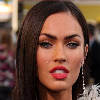
Using photoshop allows an image to be given the finished touch, some people may consider it a bad thing due to the fact you don't see the real person. Are celebrities really that perfect when seen in the media? in actual fact they usually are not. A perfect example of this is the image of Megan Fox.


Megan Fox edit: The Megan Fox image provides the perfect example of how you can change a person original photographic image. As you can see in the first image of Megan Fox she has spots on her cheek, after i have finished with the editing of the image she will not. This is due to the spot healing tool that i have used to change the image, taking a cut from one part of the picture close to the actual spot i have placed it over the image and therefore covering the spot. 


This is the image before the edit as you can see there is spots on her chin and her cheek.


This is the after image once i had completed the edit as you can see there is no spots on her chin or her cheek.


I also learnt how to manipulate a image using a color change, i did this by making 2 exact copies of the image then changing the background image to black and white, then on the foreground image I specifically selected the red lips, and then i changed the foreground image to black and white as well, therefore leaving the lips red and the rest of the image in black and white. If the summary is not clear hear is an example of one i used.


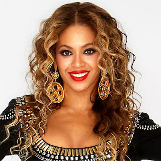
This is an image that i found on google of Beyonce i thought it would be good because of the red lips, I knew that these would stand out.


 This is the image once i had edited it as you can see i have left the red lips to stand out whilst changing the rest of the image to black and white.


Another example is the edit of Rhianna that i have done using the techniques i have been taught on photoshop. I have inverted the colors to create this image of Rhianna in black and white with the red lips.


Wednesday, 1 February 2012

Cohen's Moral Panic

What is Moral Panic?
Moral Panic - A condition, episode, person or group of people is portrayed as a threat to society values and interests. This is often a stereotyped representation brought around by the mass media.

Historical perspectives: 
  • Football, 100 years ago - hooliganism
  • Video games, 1990s - now
  • Video nasties, 1980s
  • Internet (IM, SNS) 2000S - now
Cohen says that:
Concern: Behaviour of a group is represented as a threat
Volatility: Panics that erupt dramatically, but do not sustain (short lived) - This has a negative result for the rest of us.
Hostility: "folk devils" constructed to create a clear division between "them" and "us"
Consensus: Widespread acceptance of the threat. Generally not reflective of the whole nation.  
Disproportionality: Wild exaggeration of evidence. Not only the number of people involved but also the scale of the problem.

Examples of moral panics:


This is an example of moral panics as many people felt it was inappropriate, due to the extreme violence - thinking the public may copy the ideas.


This is another example of a moral panic.


Adaptation to a music magazine:
I could use this theory to promote interesting dangerous stories. I could use it to create exclusive stories that push the boundaries, making people more interested. Therefore I could portray the audience creating a moral panic, or play on stereotypes. I could portray the celebrity in the negative way.

Thursday, 26 January 2012

Magazine

Magazine - Vibe, Q
Vibe magazine is a magazine which founds itself on the R&B Hip hop genres of the music industry, however it also publishes stories of not only artist but actors as well.I have also taken an interest into the music magazine Q this magazine is a magazine that founds itself on extensive reviews. I have gained an insight into the sorts of terminology that is implemented in the creation of a music magazine - therefore taking the original front cover i have designed an outline to a draft of a music magazine.

The image of the one,the only, mariah carey takes up 50% of the photo and is in the foreground of the magazine front cover, she even takes place in front of the actual magazine title "vibe" this is known as the masthead. This suggests about the magazine that the main focus of this addition is the female charater.
There is a use of features, this shows what stories will be in the magazine, for example in this issue there is "50 cent" story. There is the masthead which is "vibe" this is the title of the magazine. There is also the use of the main image this is the image of the female that takes up 505 of the front cover. However the use of buzz words is also effective for example the exclusives is the buzz word for this magazine. However there are no incentives mentioned on this issue of the magazine. Therefore all of these help sell the magazine for the demographic group.
Semiotics is a tough part to analyze of the front cover of the magazine, this is because semiotics is all about how does a sign represent something else. And by looking at this magazine front cover there are no obvious uses of semiotics. However the colors that have use fir example the silver color giving the connotation of a fresh and new stories in magazine terms "exclusive".

This magazine front cover clearly applies to the male gaze theory, this is the theory which suggests that women are seen as objects. However this women Mariah Carey is going to have an article in the issue of the magazine which is no doubt the main story. But that doesn't stop the fact that she appears to be the dressed in this manner attracting a male audience.


         This is the mock-up of a magazine with the use of the terminology.


Wednesday, 25 January 2012

Examples of rule of thirds

Rule of Thirds
In this photographic image johnny the character on the left complies with the rule of thirds as he is placed in two thirds of the image leaving the last third with the background.

Rule of Thirds

Rule of Thirds
The rule of thirds applies to the purpose of taking photographic images, this method involves the splitting of the photo into thirds, it results in the main focus taking up two thirds of the image. This leaves the other third left empty filled by the background.

Tuesday, 24 January 2012

Feminism in the Media

The male gaze theory
Laura Mulvey male gaze theory suggests that audiences watch films in two ways - voyeuristically and fetishistically. Its the idea that the audiences watch the film but are not being watched by the characters on screen most likely in the darkened cinema as other movie goers do not have to observe them either. This almost creates them being voyeurs - this can lead to two effects:

  1. Objectification of female characters in relation to this (male) gaze
  2. Narcissistic identification with an ideal image seen on the screen. 
Laura Mulvey's theory further suggests that voyeurism involves turning the
 figure into a fetish or a object. therefore making it more beautiful but more objectified. This results to female movie star,celebrated for her looks but considered as an object, this leads to them being considered more as eye candy other known as the male gaze theory.


Through my knowledge on movies from different time periods i can make the accurate judgement on how does the male gaze theory apply to the movie industry.


Transformers: After watching Transformers i feel and most other people feel that Megan Fox complies with the male gaze theory, she is instantly shown as a helper to Sam and nothing more than eye candy - also from my own knowledge i know that she is just a helper as she only stars in 2/3 of the Transformers movies after she was replaced by more eye candy.


Mission Impossible Ghost protocol: You could argue how this film would comply with the male gaze theory because of how she is shown in the scenes, however she plays a pivotal role in the film. Therefore she is not presented as an object as she brings something to the plot.


Underworld Awakening: This is another arguable movie that can or cannot be manipulated into the male gaze theory. My thoughts on it is that it does not comply with the male gaze theory because she is presented as the main character or one of the main character therefore she is not just an object, however though she can come across in this fetish way.


Sherlock Homes: I think from looking at this image that the idea of the Male Gaze theory does not imply to this film, however there may be some scene that do comply with the male gaze theory if a narcissistic identification is made.


James Bond Casino Royale: This movie is clear just from the image of the shadowing female body in the background making it clear that it complies with the male gaze theory. Plus from prior knowledge of this series of films i know that the women are almost objects a fetish, however it also applies with the idea of the narcissistic identification.